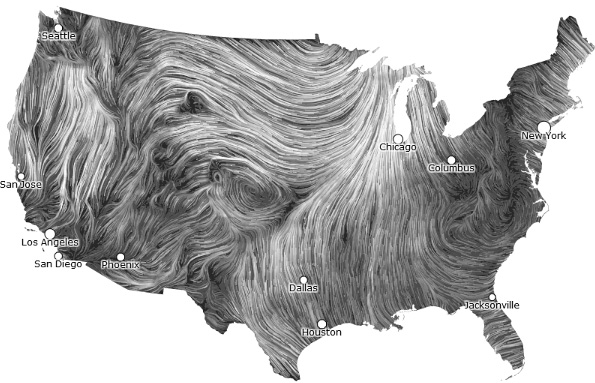
Wind Map is like watching wood breath.
Most of the time visualizations are far more pretty than meaningful, but hint.fm seem to have struck a balance between informatics, design, and fluency.
Here is a global take on a similar idea.
categories:
- look
tags:
- webtool