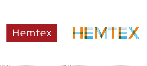
The difference in the logos is startling in a good way; the old one is so bad! The redesign focused on making the new identity look like it was made of fabric (Hemtex is a textile store in the Norway, Denmark, Sweden area). Check out the link below for a bit of analysis and a few more pictures.
categories:
- look
tags:
- design